Digital youth platform rethought: personalised UX for aha Vorarlberg
Together with aha - Jugendinfo Vorarlberg, the central contact point for young people in Vorarlberg, MASSIVE ART completely redesigned the aha website and app. The aim was to bundle information, community features and benefits into a clearly structured, mobile-optimised platform. Workshops, user testing and a well thought-out design approach were used to develop a solution that reaches young people - and puts their needs at the centre.
Client:aha Jugendinfo Vorarlberg Sector:Non-profit, Youth information Duration for UI concept:6-9 months Realisation:In progress | Services:
|
|---|
The initial situation
The aha offers young people information about jobs, living abroad, volunteering and leisure activities. However, the existing platform was getting on in years:
- The content was difficult to find, especially the benefits of the aha card.
- There was a lack of personalisation and offers were not tailored to interests or age.
- There were hardly any community features.
- The three platform areas aha info, aha plus and aha card were technically separate - with little user-friendliness.
The result
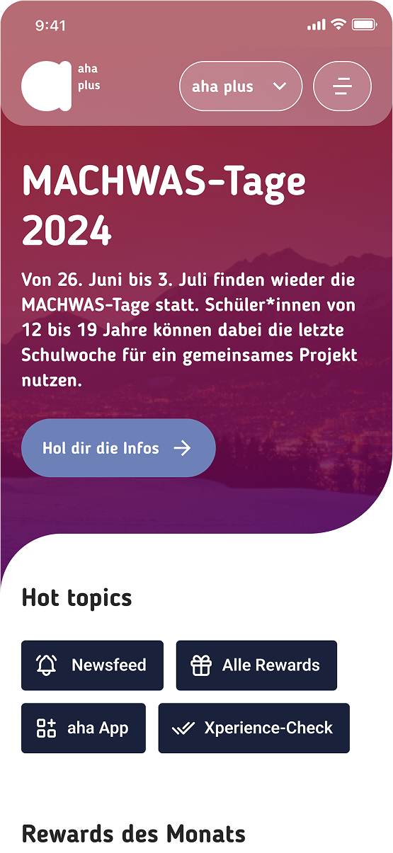
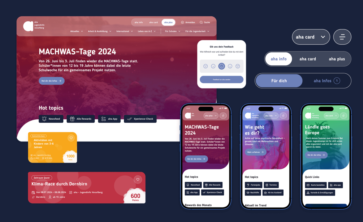
MASSIVE ART has designed a modern, personalised platform for aha Vorarlberg that consistently combines web and app. The new solution combines targeted content, community functions and a mobile user experience - tailored to the needs of young users.
Personalised UX & community features
- Introduction of Spaces for aha info, aha plus and aha card
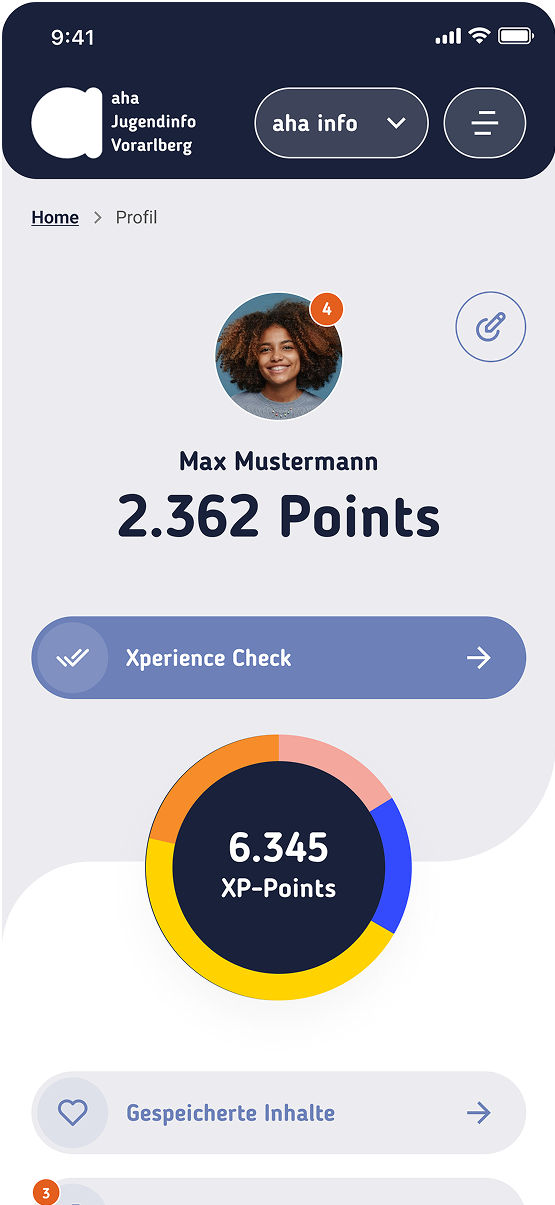
- Personal profile area with favourites function for quests, events and benefits
- In aha plus: add friends, experience quests together and share achievements
Mobile-first design & clear content structure
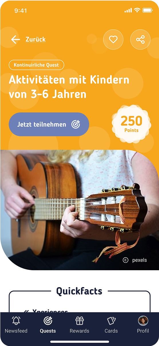
- Mobile-optimised UI with rounded elements & youth-friendly colour schemes
- New information architecture for logged in vs. not logged in users
- Content templates for quests, benefits & blog posts
- SEO-optimised integration of the blogs ahamomente.at and jugend-diskurs.at
Usability, inclusion & accessibility
- Flexible search with age and region filters
- Clearly structured navigation with visually supported orientation
- Generous touch areas, clear hierarchies and reduced complexity

These challenges have kept us busy:
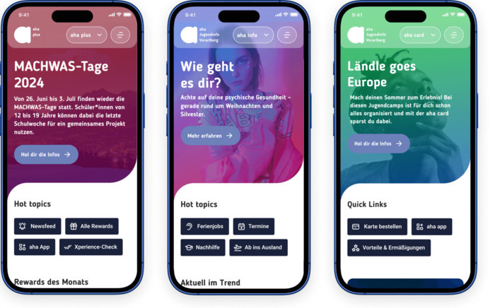
Combining three platform areas in a standardised UX
Problem: Different goals and content in aha info, aha plus and aha card - but only one app and website.
Approach:
- New information architecture with a clearer and more organised structure
- Separate but UX-consistent spaces
- Personalised content for logged-in users
- Mobile-first design for space-saving display
Result: Standardised platform, easy maintenance, comprehensible navigation - positively rated by young people.
Limited space in the app - maximum functionality
Problem: Lots of content and community functions, but limited space in the app.
Approach:
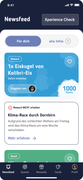
- Introduction of a newsfeed with relevant quests & events
- Integration of social features such as friends and shared quests
- Optimised bottom navigation & space-saving UI components
Result: Higher engagement, easier operation - and positive feedback from the target group.
Involving young people - for more relevance and acceptance
Problem: Heterogeneous target group with different needs and expectations.
Approach:
- UX workshops and user testing with young people
- Rapid design iterations based on the feedback
- Target group-specific optimisations in colour selection, navigation and function
Result: 97% positive feedback - young people perceive the design as "modern", "clear" and "relevant".

Key Facts & Figures
Shared achievements we have defined as our goals.

Contact us to discuss your individual challenges.
With 20 years of experience as a UX agency and hundreds of references, we at MASSIVE ART are convinced that this is proof of the effectiveness of our method.
We work for the best
A flexible platform for digital sales and an effective direct marketing tool based on HubSpot.
Fresh ideas from our blog
The latest trends and hot ideas combined with our expert knowledge - that's our blog.
